Analogous Colors : red, orange, red orange
Complimentary colors : blue, red, yellow
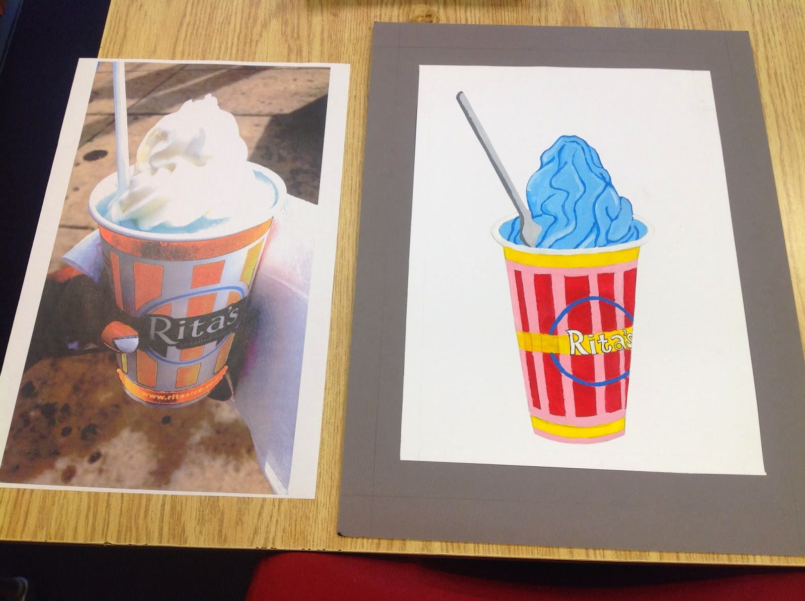
For this project we had to use two different color schemes of our choice, and use them in a way that has a contrasting effect on our image. my image is a photo i've taken myself of Rita's Italian Ice. For one aspect of my project, I painted my image using primary colors. I also included a tint of a few colors to make the composition and color selection more inviting. 

The second image was created with filters and color selection on Adobe Illustrator and Adobe Photoshop. One image features a very delicious and inviting gelati, while the other reflects a much more infused version in which the ice cream is a strange color, which may make the ice cream seem as if it is for decorative purpose only.
No comments:
Post a Comment