Tuesday, December 2, 2014
Project 6 : Nailing The Nail Art
Tuesday, November 25, 2014
Project 5 : Harmony & Discord
Analogous Colors : red, orange, red orange
Complimentary colors : blue, red, yellow
For this project we had to use two different color schemes of our choice, and use them in a way that has a contrasting effect on our image. my image is a photo i've taken myself of Rita's Italian Ice. For one aspect of my project, I painted my image using primary colors. I also included a tint of a few colors to make the composition and color selection more inviting. 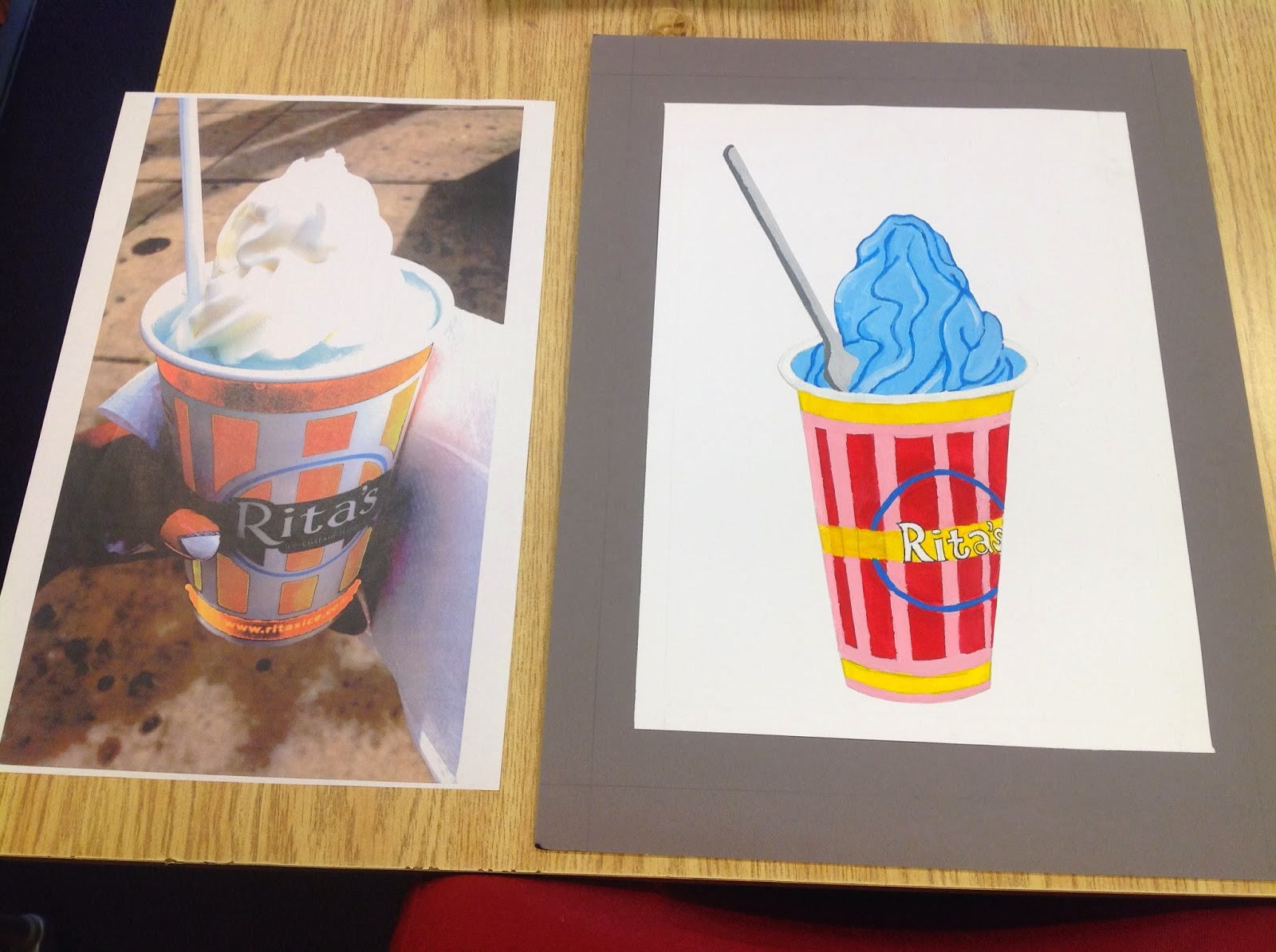
The second image was created with filters and color selection on Adobe Illustrator and Adobe Photoshop. One image features a very delicious and inviting gelati, while the other reflects a much more infused version in which the ice cream is a strange color, which may make the ice cream seem as if it is for decorative purpose only.
Project 4 - Transparency Studies

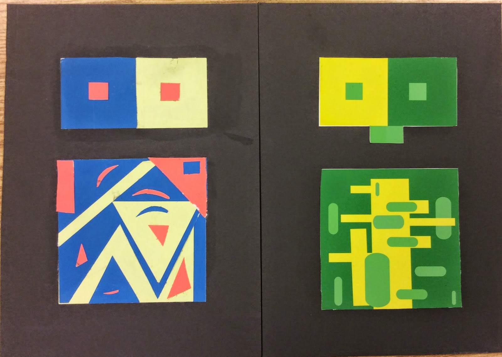
 The assignment was to create a composition displaying at least four
examples of transparency as according to our transparency studies. The
second part of the assignment was to create an animation, showing the
transparencies occurring. For my animation, I used basic shapes with the
color matches form my transparency studies. My transparency shapes are
changing in size, color, shape and also location. This was a fun
project. Simple shapes are coming to life !
The assignment was to create a composition displaying at least four
examples of transparency as according to our transparency studies. The
second part of the assignment was to create an animation, showing the
transparencies occurring. For my animation, I used basic shapes with the
color matches form my transparency studies. My transparency shapes are
changing in size, color, shape and also location. This was a fun
project. Simple shapes are coming to life !Project 4 - Transparency Animation

The assignment was to create a composition displaying at least four examples of transparency as according to our transparency studies. The second part of the assignment was to create an animation, showing the transparencies occurring. For my animation, I used basic shapes with the color matches form my transparency studies. My transparency shapes are changing in size, color, shape and also location. This was a fun project. Simple shapes are coming to life !
Saturday, November 22, 2014
Project 3 : Simultaneous Contrast
Thursday, November 20, 2014
Project 2 - Vibrating Edges

Tuesday, November 18, 2014
Project 1 - Color Wheel & Monochromatic Painting

We had to make a Munsell twelve-step color wheel including tints and shades. We also had to create a monochromatic painting, based off of the tint and shades color we chose. I chose blue as my color because my image I took was of fruit, and there are no real blue fruits in this world. I chose blue for the irony, and because the color is my personal favorite. I had a hard time making the red violets and red orange colors.
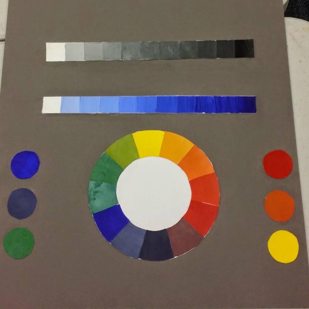 I have found that I did not explore the colors enough, with the paint because I needed to spare it wisely. I also have a hard time getting a full range of value on such a small scale. I have a poor habit of going from dark to light, opposed to light to dark starting with the whites. During the critique I was given feedback to add the darker blue values to the bottom of my monochromatic painting, since there are few spots that display the value itself. I was satisfied with my monochromatic painting as a result, because it mastered the ideal abstract design, but you could still make out the fruit items of the peach, grapes, and strawberries. I enjoyed this project, but for future projects I will explore the paint much more to get the exact colors found on the color wheel provided by Munsell.
Subscribe to:
Comments (Atom)