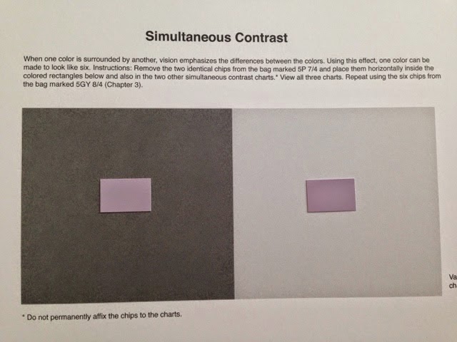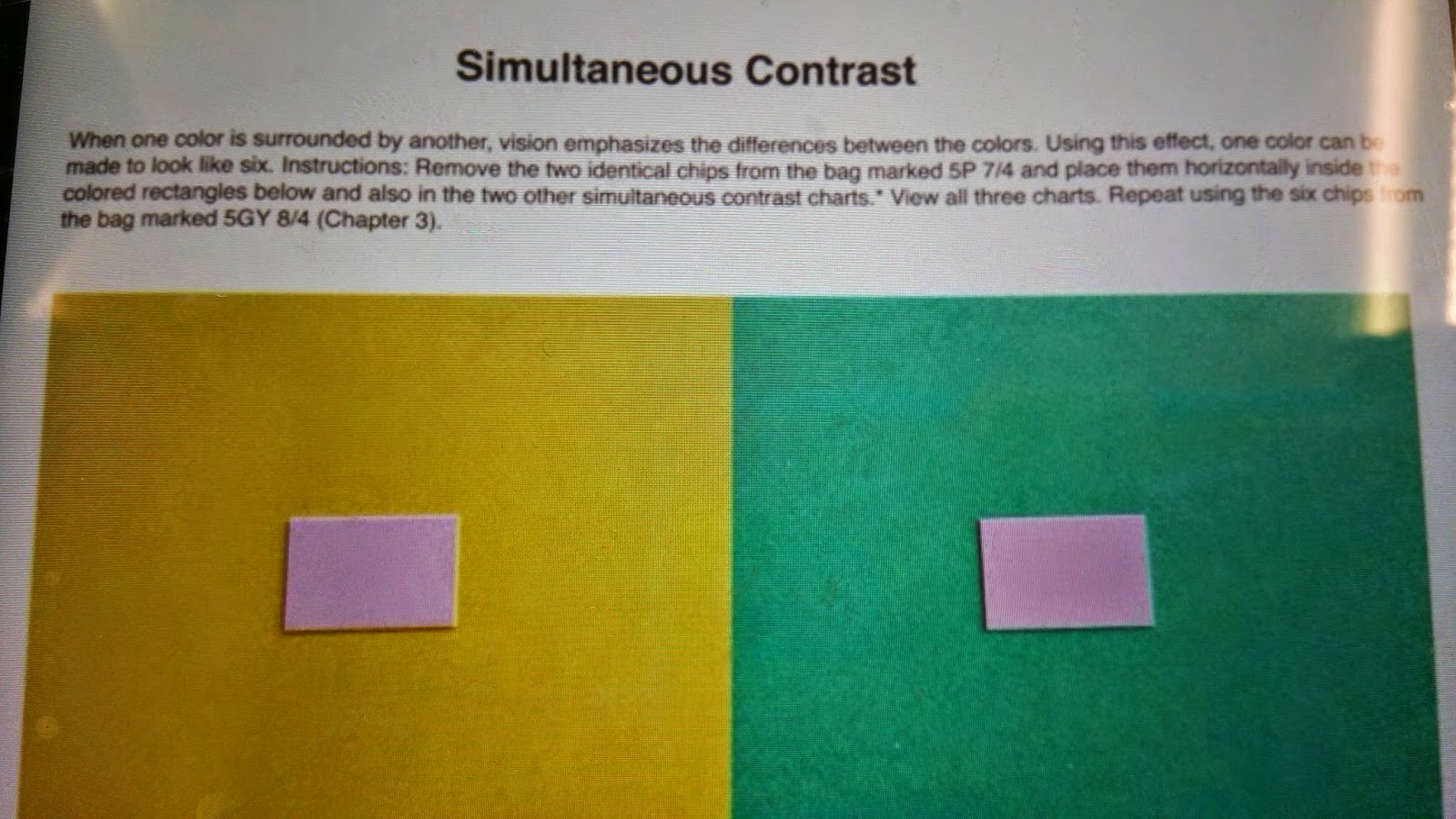
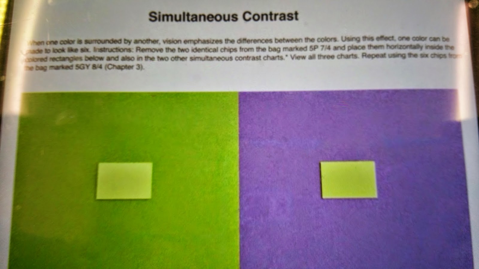

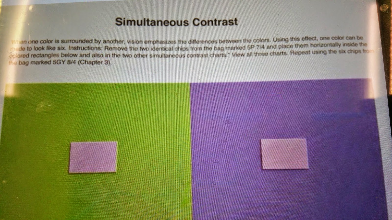
 We were given instructions to select specific colors from our Munsell Charts and position them on the color swatches. The point of the project was to see similar colors change slightly or dramatically when an opposing darker, or lighter value is placed under it.
 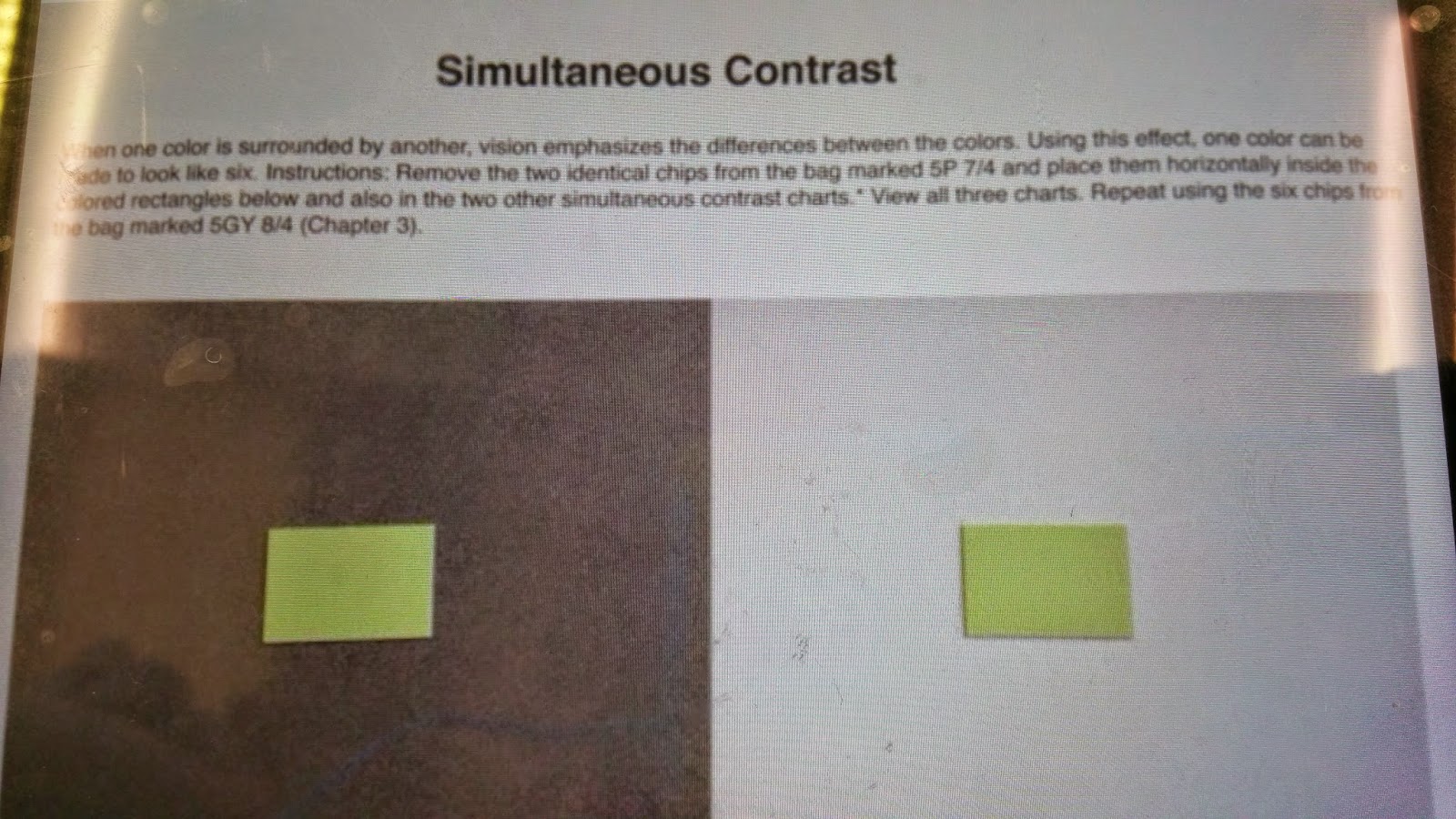 We performed the same project three times for each of the colors. You can see the purple values get progressively darker when placed on a light grey swatch, but darker on a black swatch. You can see the or green swatch. You can also see the green values get darker on the teal swatch, more saturated on the green swatch, and lighter on the black swatch.