Tuesday, December 2, 2014
Project 6 : Nailing The Nail Art
Tuesday, November 25, 2014
Project 5 : Harmony & Discord
Analogous Colors : red, orange, red orange
Complimentary colors : blue, red, yellow
For this project we had to use two different color schemes of our choice, and use them in a way that has a contrasting effect on our image. my image is a photo i've taken myself of Rita's Italian Ice. For one aspect of my project, I painted my image using primary colors. I also included a tint of a few colors to make the composition and color selection more inviting. 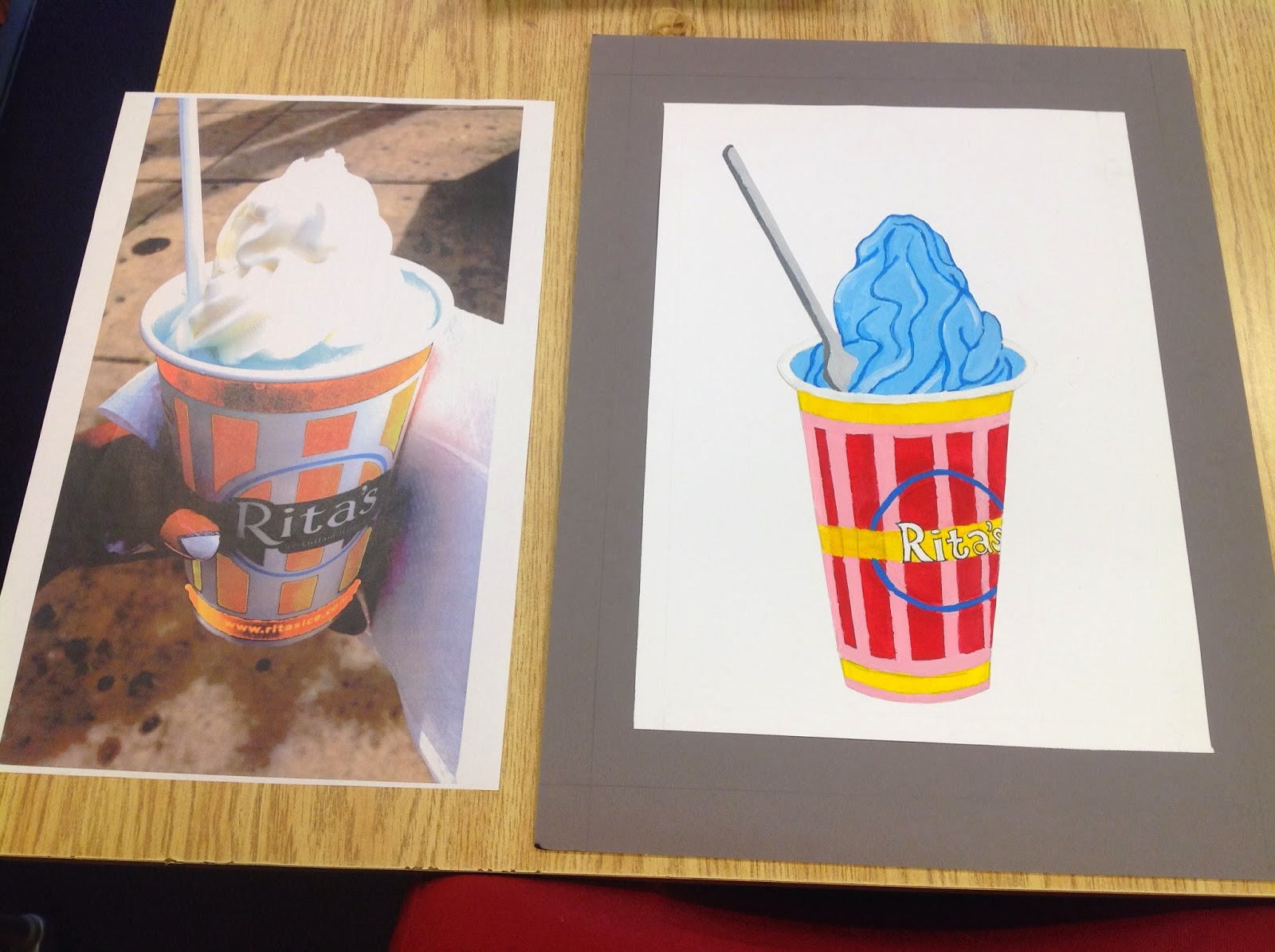

The second image was created with filters and color selection on Adobe Illustrator and Adobe Photoshop. One image features a very delicious and inviting gelati, while the other reflects a much more infused version in which the ice cream is a strange color, which may make the ice cream seem as if it is for decorative purpose only.
Project 4 - Transparency Studies

 The assignment was to create a composition displaying at least four
examples of transparency as according to our transparency studies. The
second part of the assignment was to create an animation, showing the
transparencies occurring. For my animation, I used basic shapes with the
color matches form my transparency studies. My transparency shapes are
changing in size, color, shape and also location. This was a fun
project. Simple shapes are coming to life !
The assignment was to create a composition displaying at least four
examples of transparency as according to our transparency studies. The
second part of the assignment was to create an animation, showing the
transparencies occurring. For my animation, I used basic shapes with the
color matches form my transparency studies. My transparency shapes are
changing in size, color, shape and also location. This was a fun
project. Simple shapes are coming to life !Project 4 - Transparency Animation
The assignment was to create a composition displaying at least four examples of transparency as according to our transparency studies. The second part of the assignment was to create an animation, showing the transparencies occurring. For my animation, I used basic shapes with the color matches form my transparency studies. My transparency shapes are changing in size, color, shape and also location. This was a fun project. Simple shapes are coming to life !
Saturday, November 22, 2014
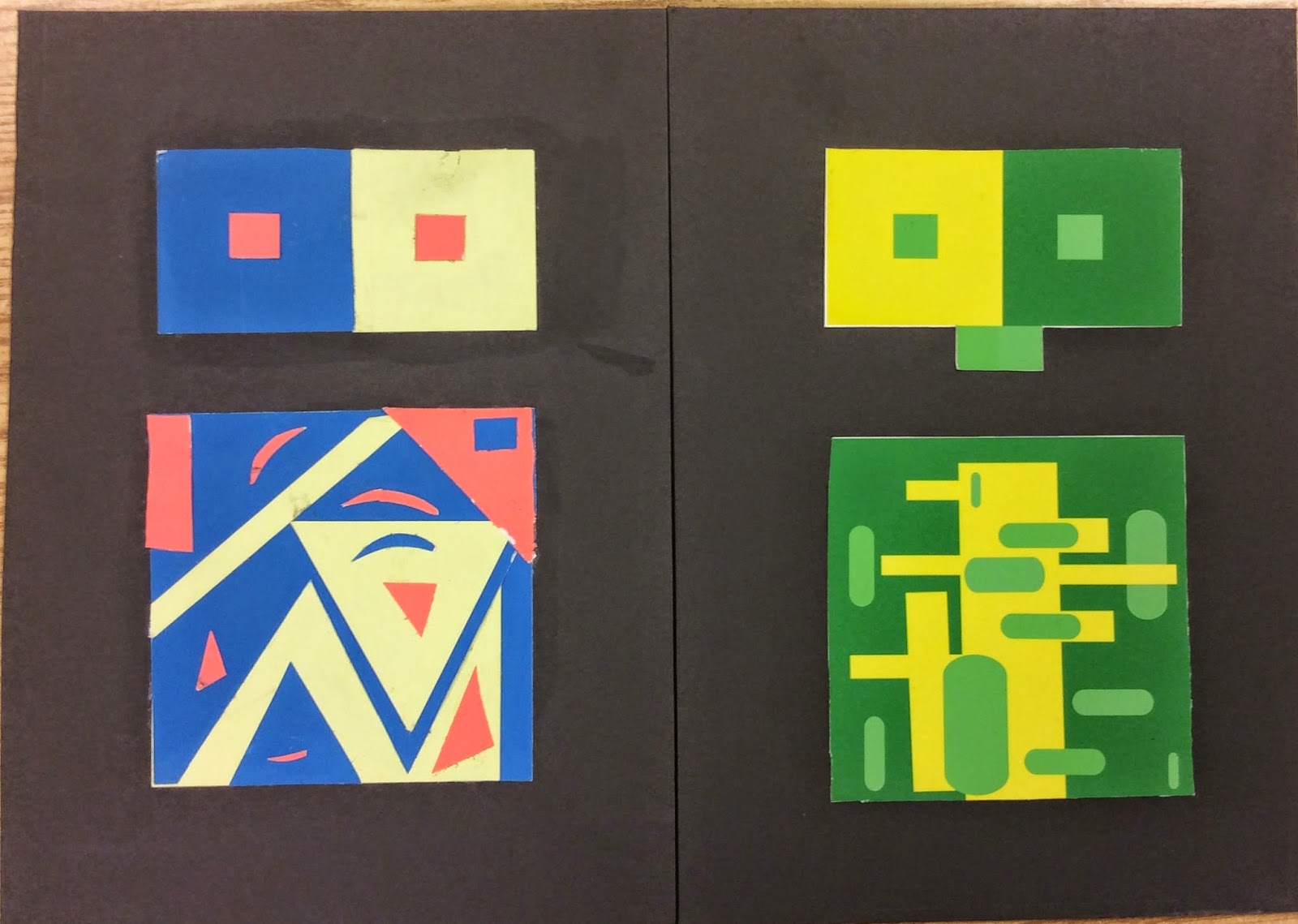
Project 3 : Simultaneous Contrast
Thursday, November 20, 2014
Project 2 - Vibrating Edges
Assigned to create two patterns displaying colors with vibrating edges. The relationship between the two colors is what makes them vibrate. Both colors are equal in value and equal in intensity, but they are opposite in hue. This combination will result in a vibrating relationship along the edges where the colors meet. I created my patterns using Adobe Illustrator. I used a simple box filled with my first specific color, followed by another box filled with my second color. In regards to the shape, I tested the star tool, adding and deleting anchor points for an interesting shape. My third pattern is a combination of my first and second, but I adjusted the opacity, and overlapped certain sections of my first pattern onto the background of my first. you can see spherical shapes with lower opacity, making this a pattern of a pattern.
Tuesday, November 18, 2014
Project 1 - Color Wheel & Monochromatic Painting
We had to make a Munsell twelve-step color wheel including tints and shades. We also had to create a monochromatic painting, based off of the tint and shades color we chose. I chose blue as my color because my image I took was of fruit, and there are no real blue fruits in this world. I chose blue for the irony, and because the color is my personal favorite. I had a hard time making the red violets and red orange colors.
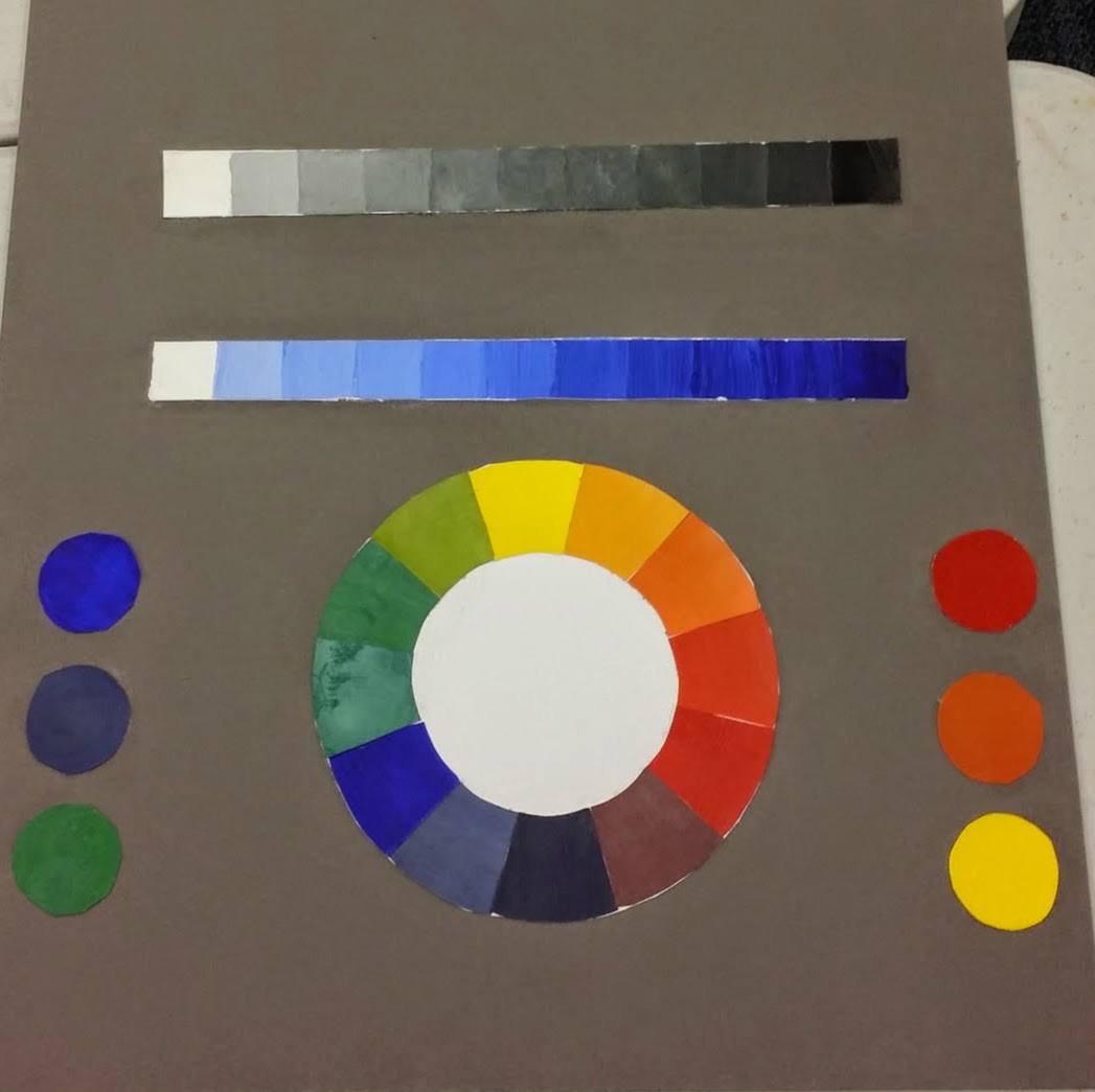 I have found that I did not explore the colors enough, with the paint because I needed to spare it wisely. I also have a hard time getting a full range of value on such a small scale. I have a poor habit of going from dark to light, opposed to light to dark starting with the whites. During the critique I was given feedback to add the darker blue values to the bottom of my monochromatic painting, since there are few spots that display the value itself. I was satisfied with my monochromatic painting as a result, because it mastered the ideal abstract design, but you could still make out the fruit items of the peach, grapes, and strawberries. I enjoyed this project, but for future projects I will explore the paint much more to get the exact colors found on the color wheel provided by Munsell.
 Tuesday, November 4, 2014
Munsell Charts - Harmonious & Balanced Color Groups
A popular theory, based on observations of nature, postulates that harmonious and balanced groups of colors are pleasing. According to this theory, harmonious color groups comprise similar colors, and balances color groups comprise opposite or nearly opposite colors.
Munsell Charts - Color Control & Color Sequences
.JPG)
.JPG) Often, an artist of designer wishes to create an appearance of unity in a work. This can be accomplished by establishing a dominant hue, value, and chroma, and repeating them throughout the work. To prevent monotony, a few colors that contrast in hue, value, and chroma are also used. In aerial perspective, the illusion of distance is created by making
a color more blue than gray. Munsell postulated that dissimilar colors
can be harmonized by creating a sequence between them.
Often, an artist of designer wishes to create an appearance of unity in a work. This can be accomplished by establishing a dominant hue, value, and chroma, and repeating them throughout the work. To prevent monotony, a few colors that contrast in hue, value, and chroma are also used. In aerial perspective, the illusion of distance is created by making
a color more blue than gray. Munsell postulated that dissimilar colors
can be harmonized by creating a sequence between them. Munsell Charts - Color Assimilation & Optical Mixture, Transparency & Iridescence Exercises
When one color is surrounded by another, vision emphasizes the difference between the colors. However, when colors are alternated in very thin stripes or tiny dots the opposite effect occurs ; vision emphasizes the similarity between the colors and they appear more alike. If the stripes are very thin or the dots tiny, or if viewed from a distance, vision is unable to differentiate the colors and they appear mixed.
Munsell Charts - Matte & Glossy Colors
Monday, October 27, 2014
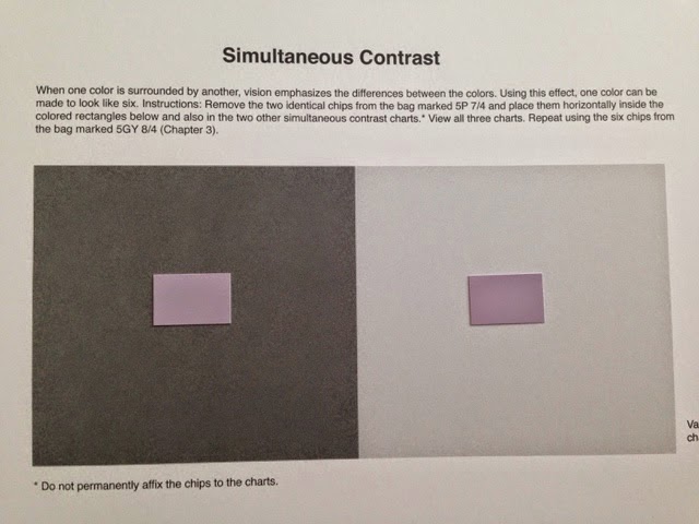
Munsell Charts - Simultaneous Contrast
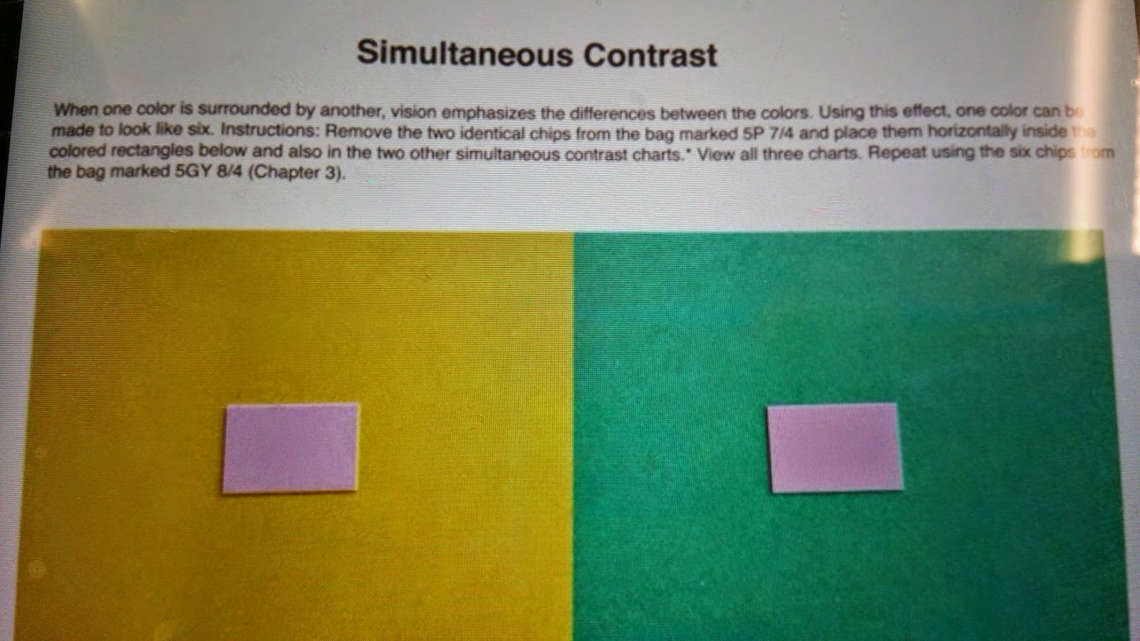
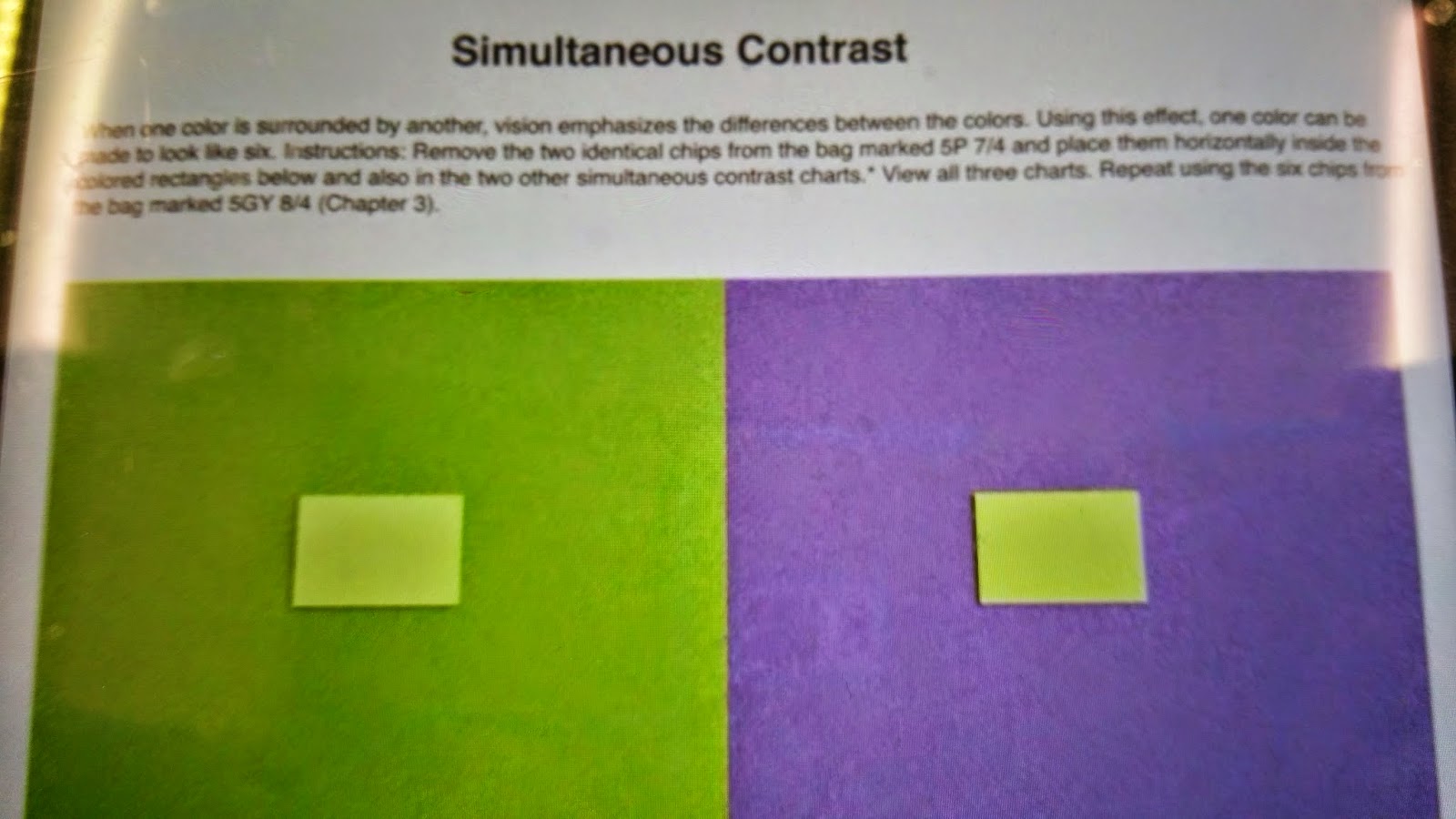

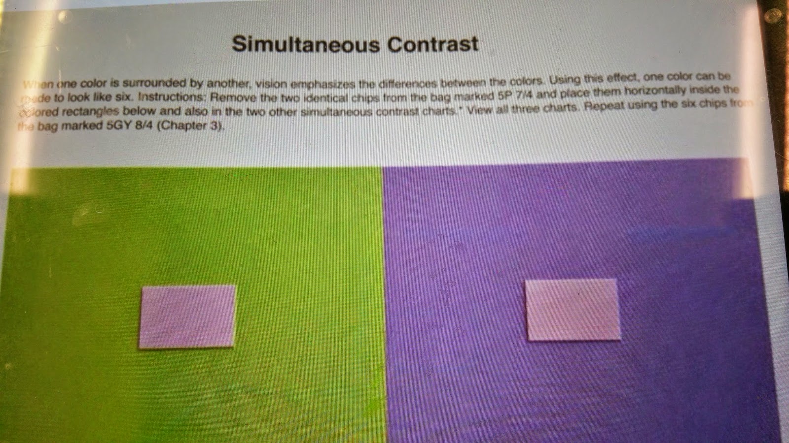 We were given instructions to select specific colors from our Munsell Charts and position them on the color swatches. The point of the project was to see similar colors change slightly or dramatically when an opposing darker, or lighter value is placed under it.
 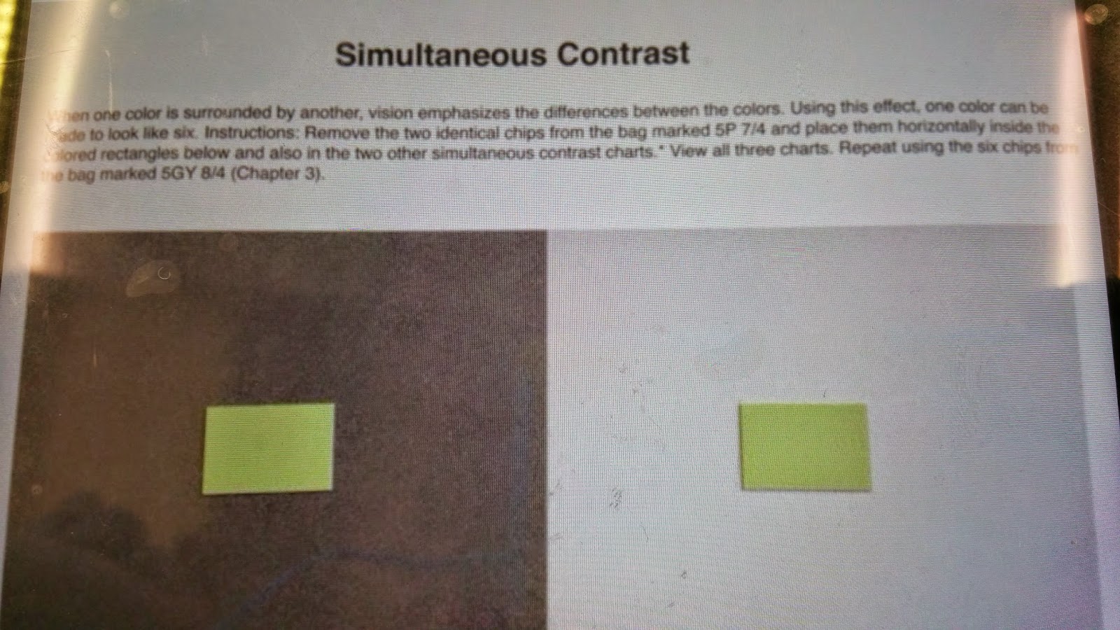 We performed the same project three times for each of the colors. You can see the purple values get progressively darker when placed on a light grey swatch, but darker on a black swatch. You can see the or green swatch. You can also see the green values get darker on the teal swatch, more saturated on the green swatch, and lighter on the black swatch.
Tuesday, September 30, 2014
Munsell Charts - Advancing & Receding Colors
Successive Contrast & Vibrating Boundaries
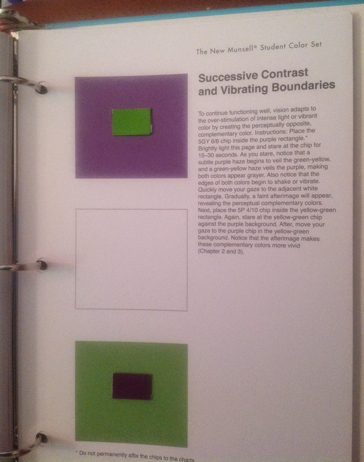
Chips Were Chosen From The Munsel Color Chart Of Swatches Previously Done.
Selected Chips Demonstrate The Effect Of Advancing & Receding Colors.
Tuesday, September 9, 2014
Subscribe to:
Posts (Atom)



.JPG)
.JPG)

.JPG)
.JPG)

2.jpg)
.JPG)